STICTAC:
LET'S STICK TOGETHER.
OVERVIEW
SticTac believes in the power of doing, and doing your best means having the right tools to do so. Even with so many choices, we are often left in the dark with what we have to use. So SticTac closely worked with us to develop a brand strategy and a tone of voice that will strike a balance between product and editorial, showing exactly how SticTac is the right tool for you.
THE CHALLENGE
In a time when doing is such an important aspect of one's life, how do we get you to do your best?
OUR STRATEGY
Our strategy revolved around highlighting the fact that SticTac does the work for the makers and doers. It was then important to solidify a visual identity that's it easy to understand, easy to differentiate, and easy to use.
For SticTac, something so small can do big wonders. As a tape brand, SticTac is well aware there will always be the right kind for you. And they make it happen at the right price, too.
WHAT WE MADE
The usual DIY brand is often intimidating, if not serious. With SticTac, we wanted to help the brand stand out in the category by creating an identity built on an industrial, do-it-yourself look with a modern take. We expressed the concept of work through a design that is fun and accessible. We reimagined technical icons and maximized the use of patterns, overall making productivity accessible and relatable for everyone.
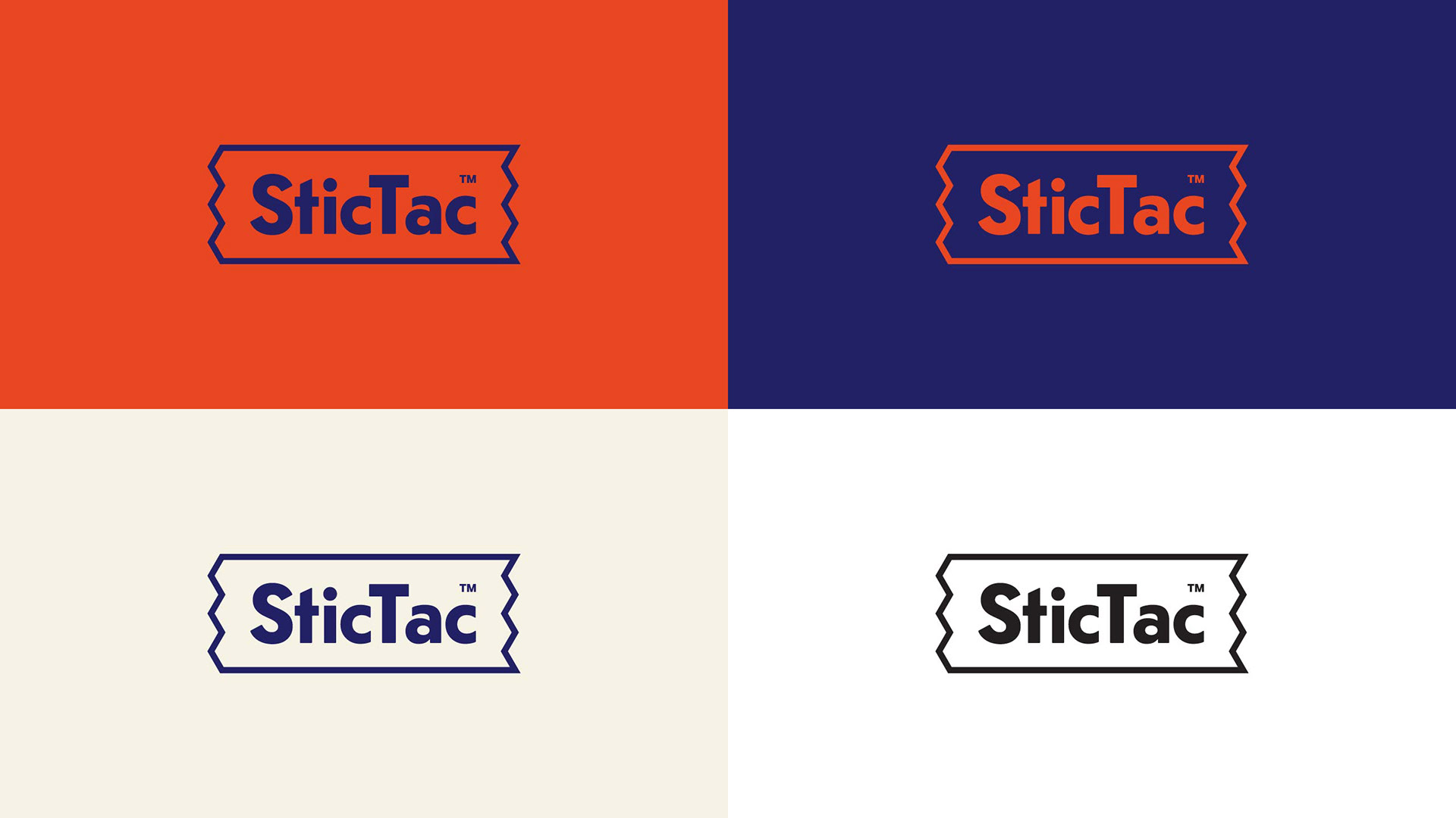
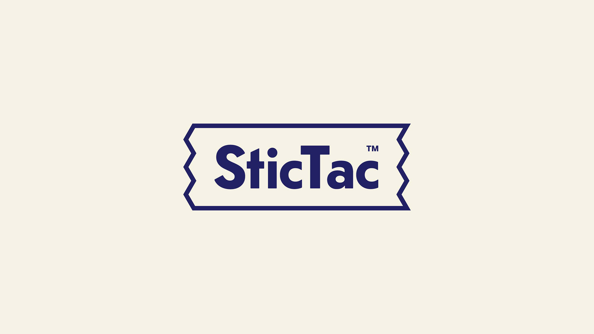
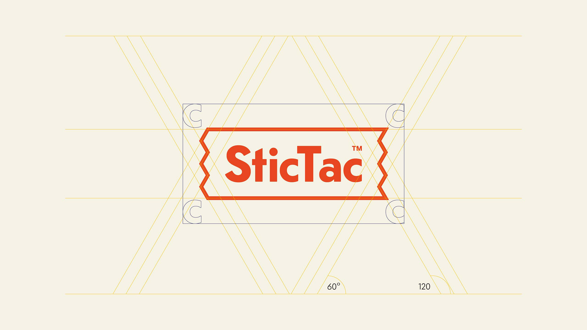
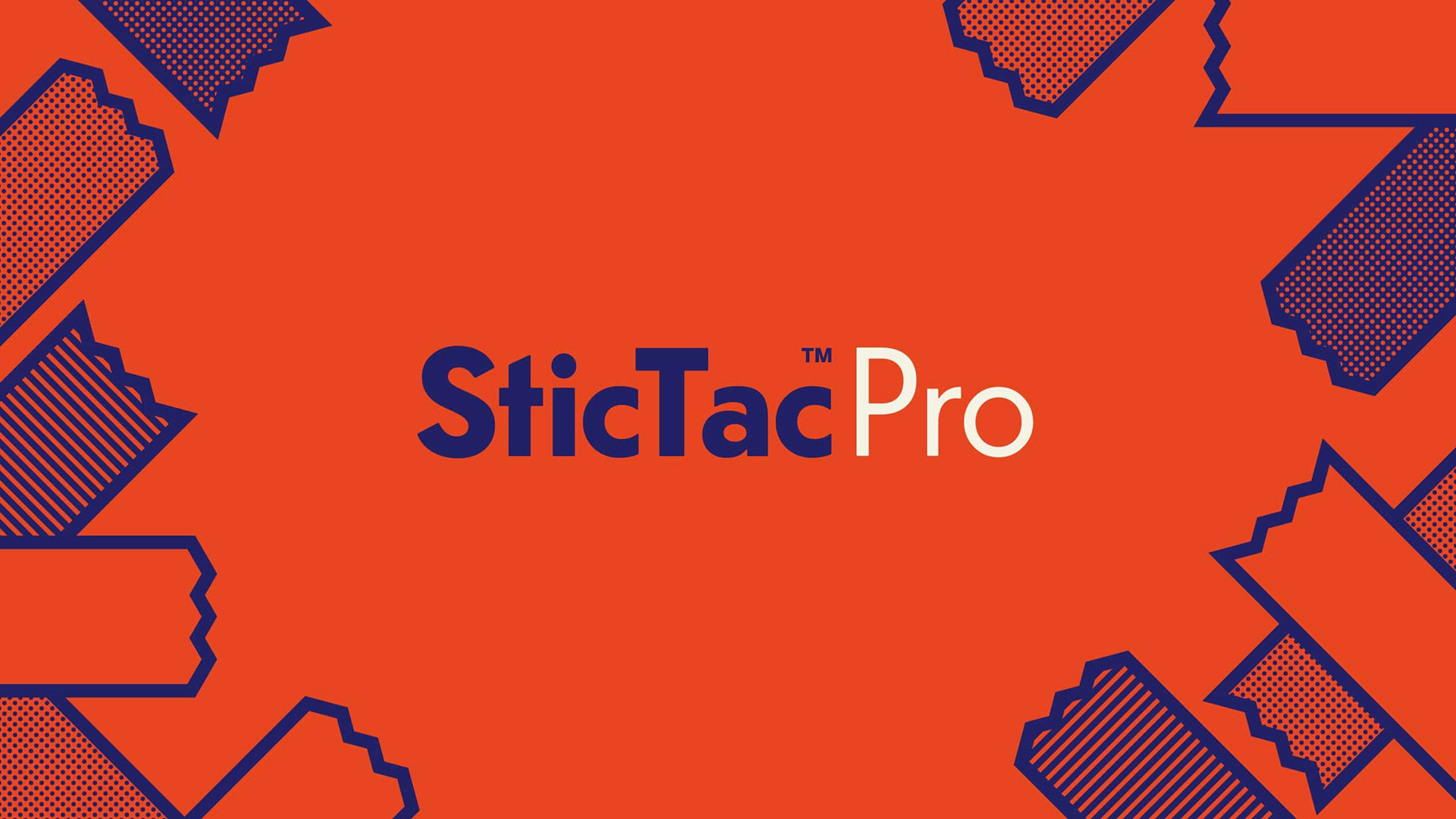
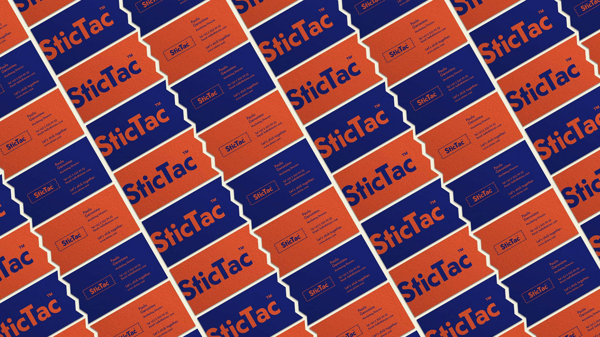
The logo is bold and straightforward to indicate the idea of no-frills work, but is bounded within a zigzag frame for a little play. This frame then becomes modular, inspired by how SticTac is driven by two factors important to makers and doers: utility and adaptability, making all kinds of work easy.
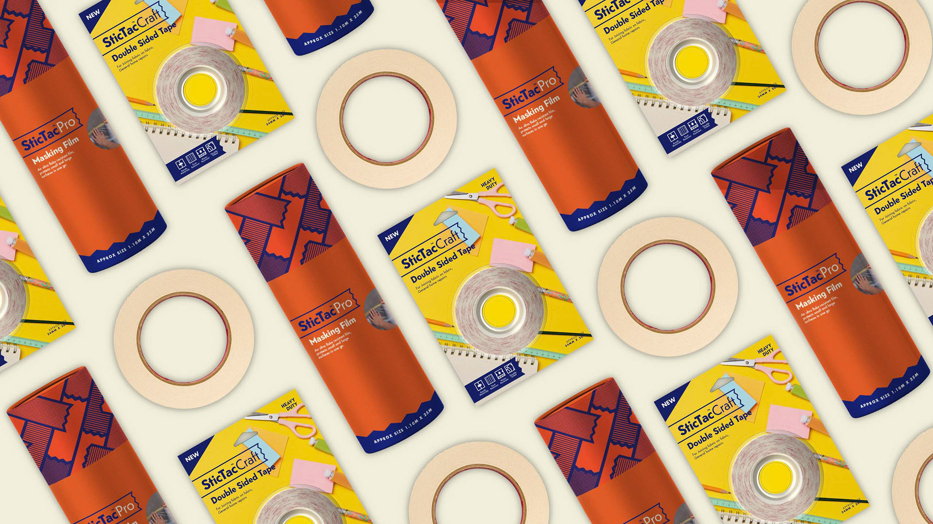
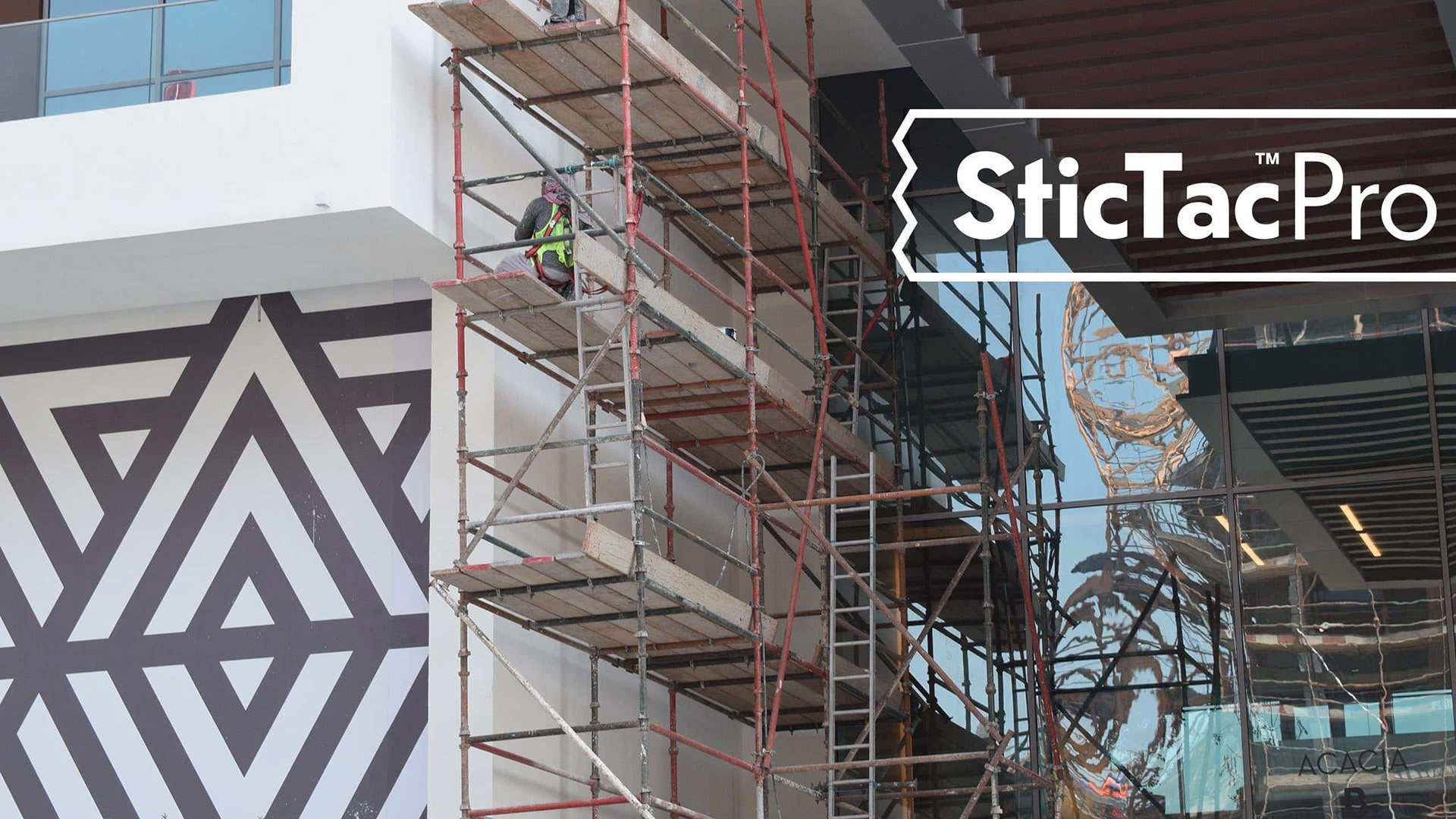
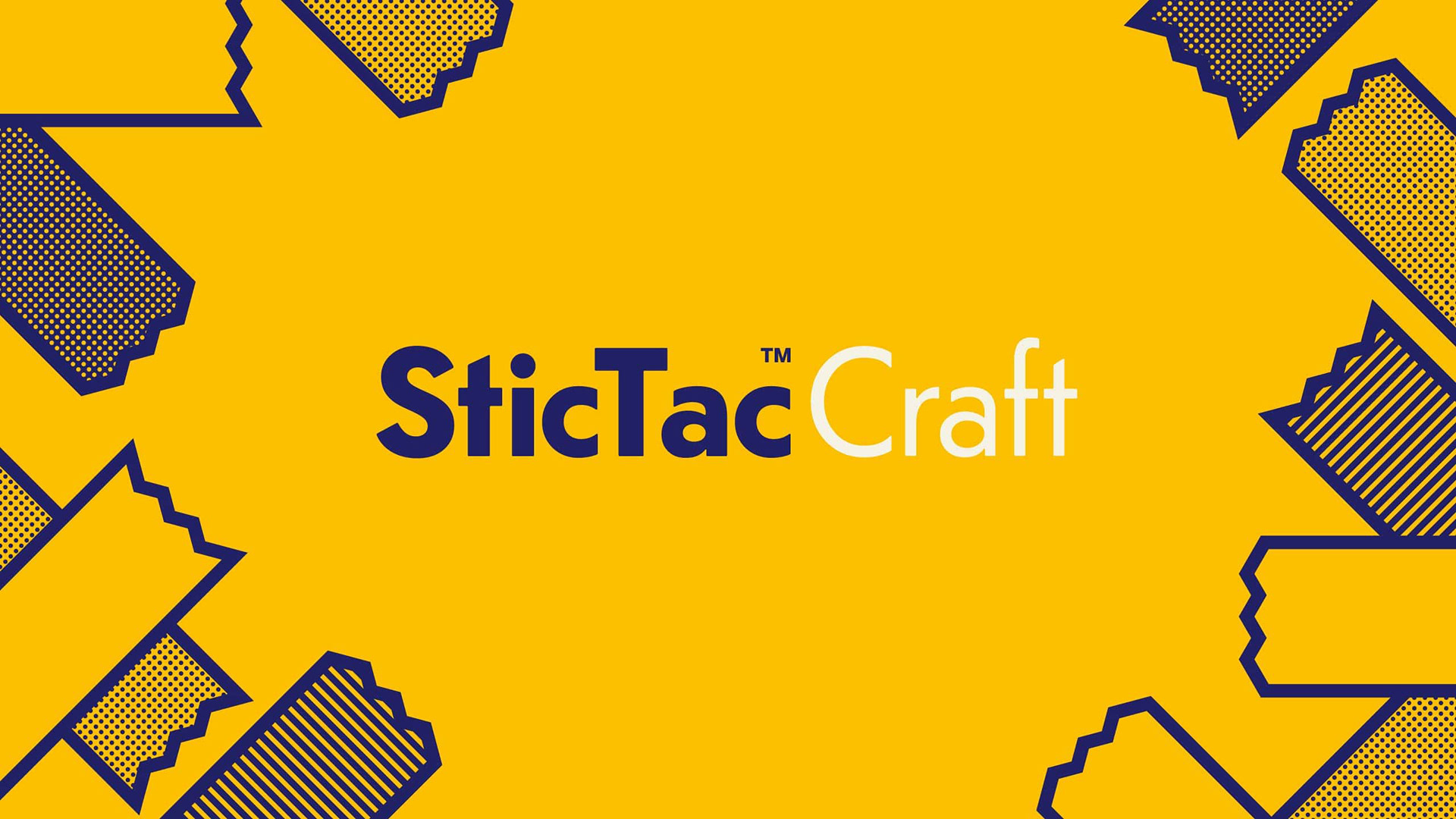
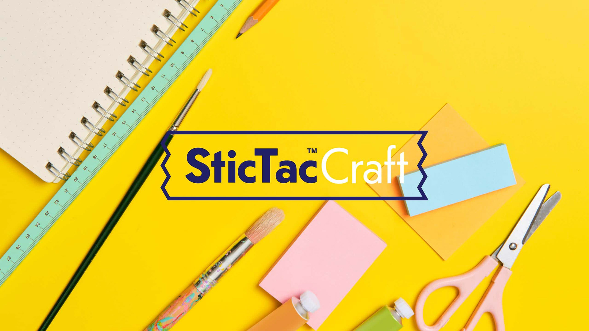
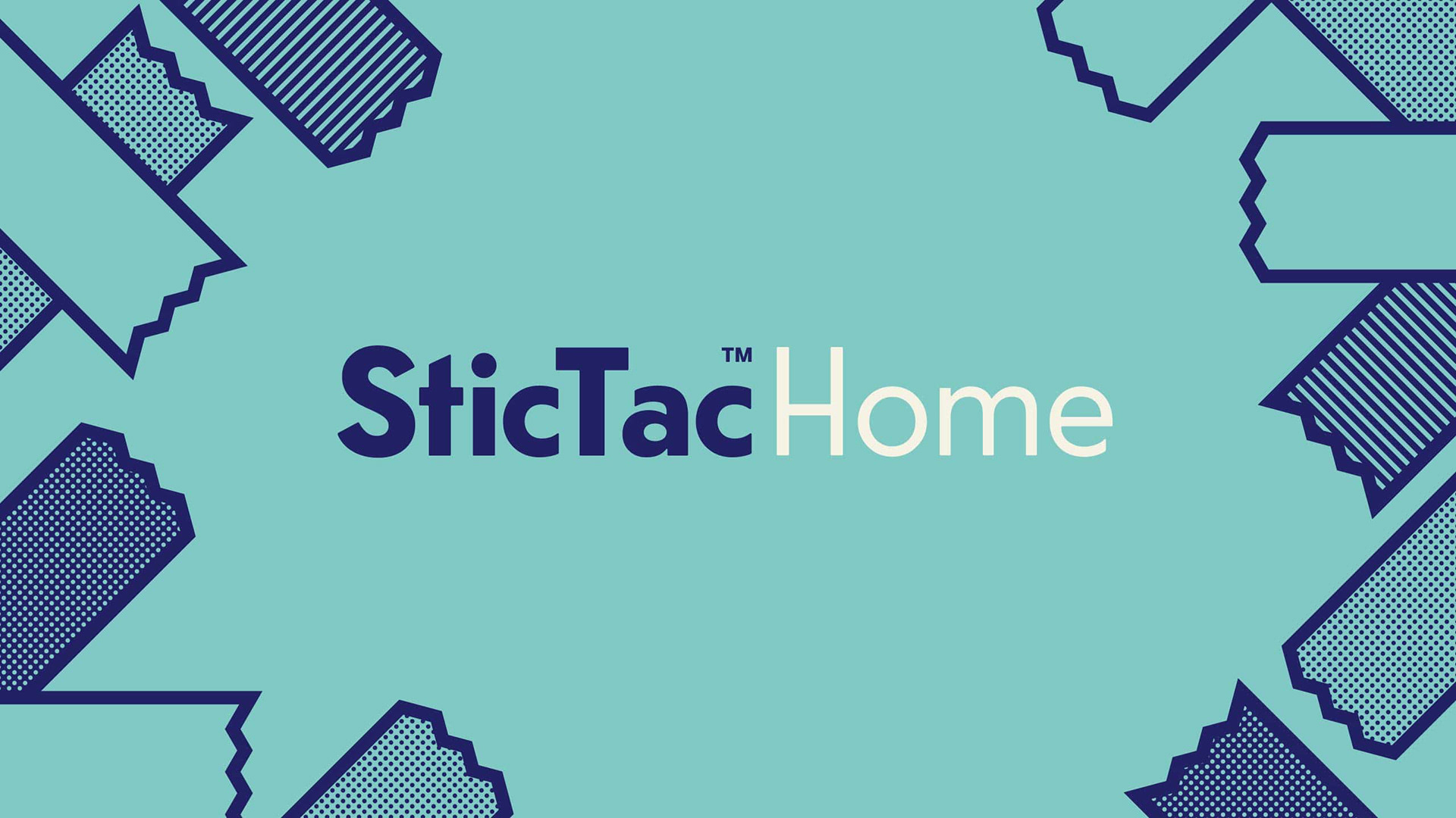
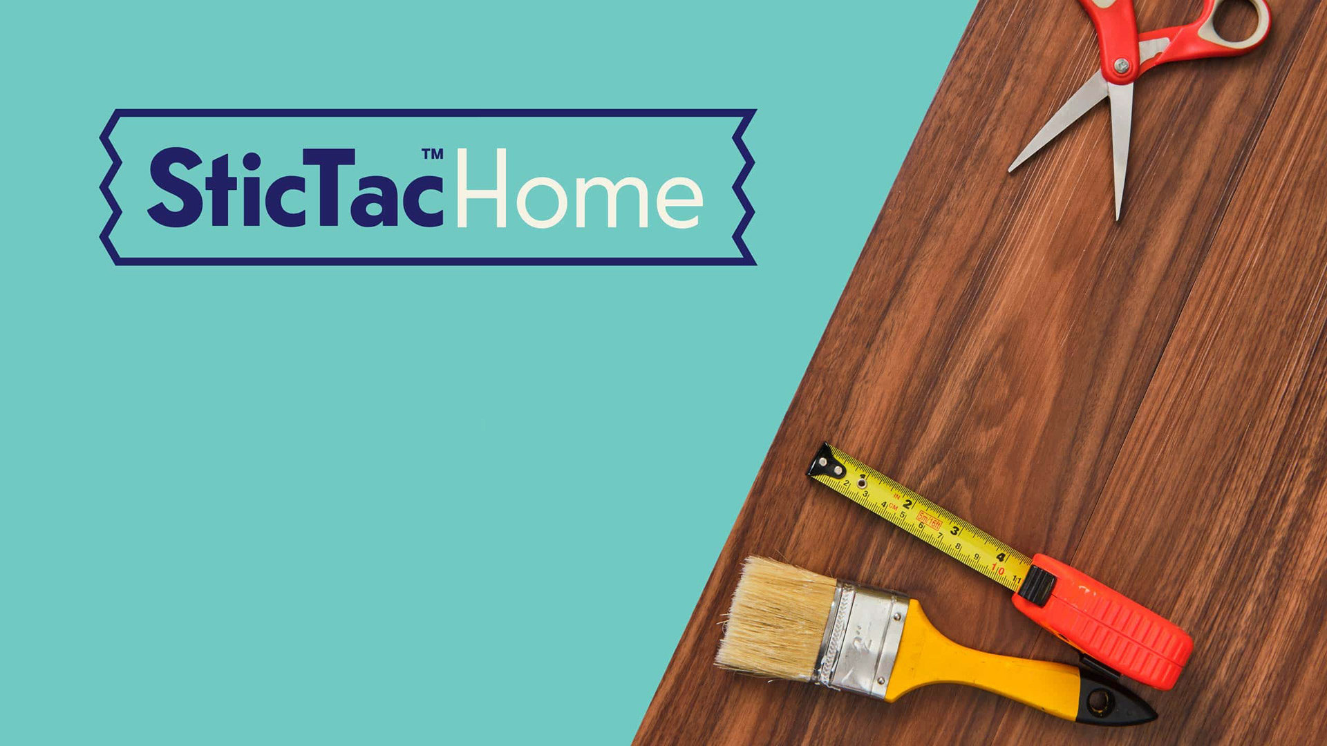
With a modular logo, we were able to create different sub-brands that focus on the specific use of the tape — for industrial use, for arts and crafts, and for home improvement projects.
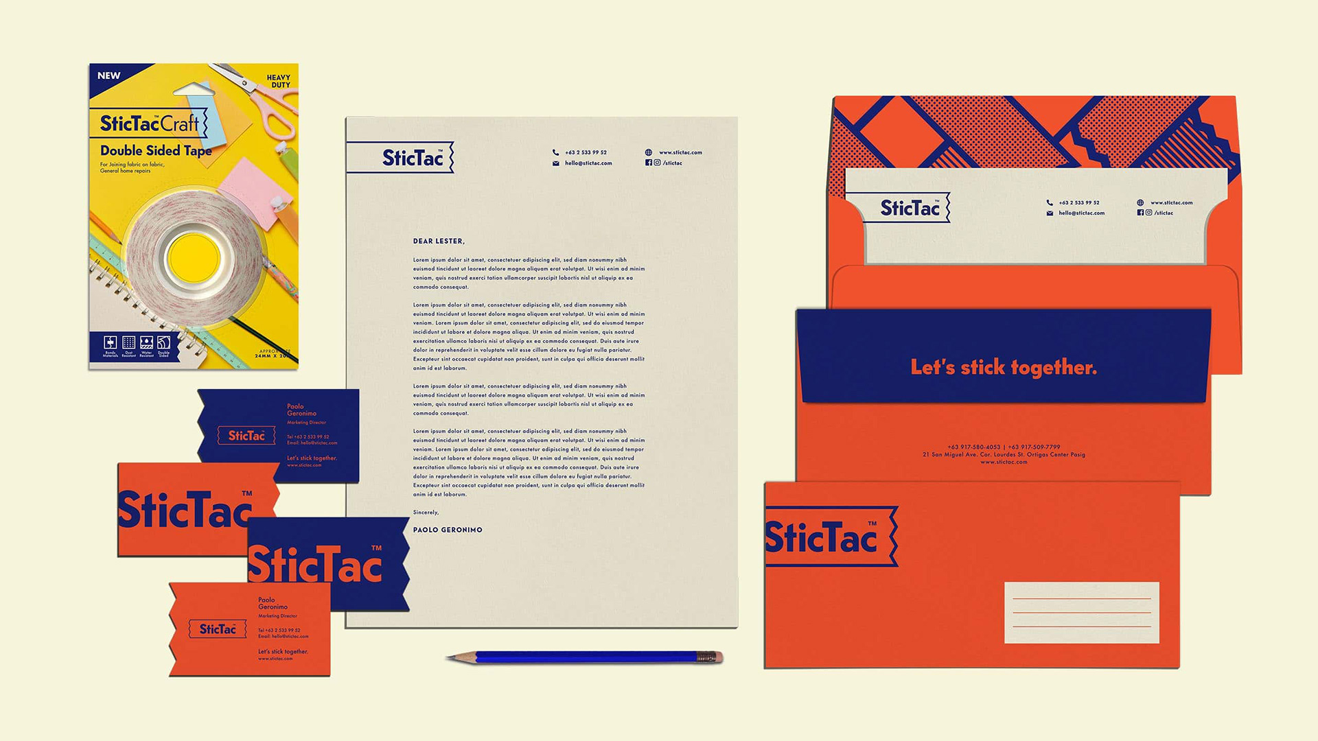
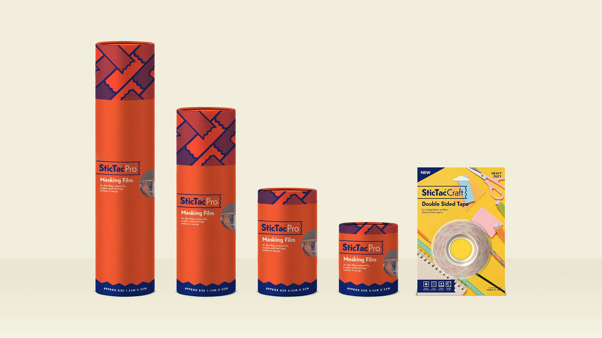
True to its promise of delivering the ease of choice to its market, SticTac is founded on a clear system through the use of colours and design elements created specifically for the brand. This makes differentiating through products and navigating through their specific uses easier.
Icons are intentionally designed to be visually accessible and to help it become a primary touchpoint of the brand.

Fun is injected through patterns that can be used in monotone and in full color.
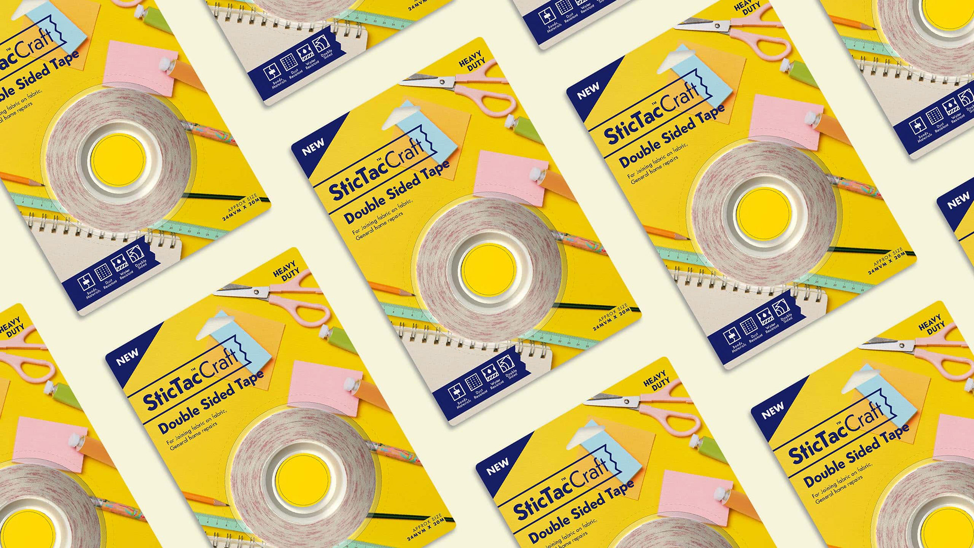
Important information is given emphasis through sizing and color, which simplifies the product experience for people. No information is treated secondary through the packaging.
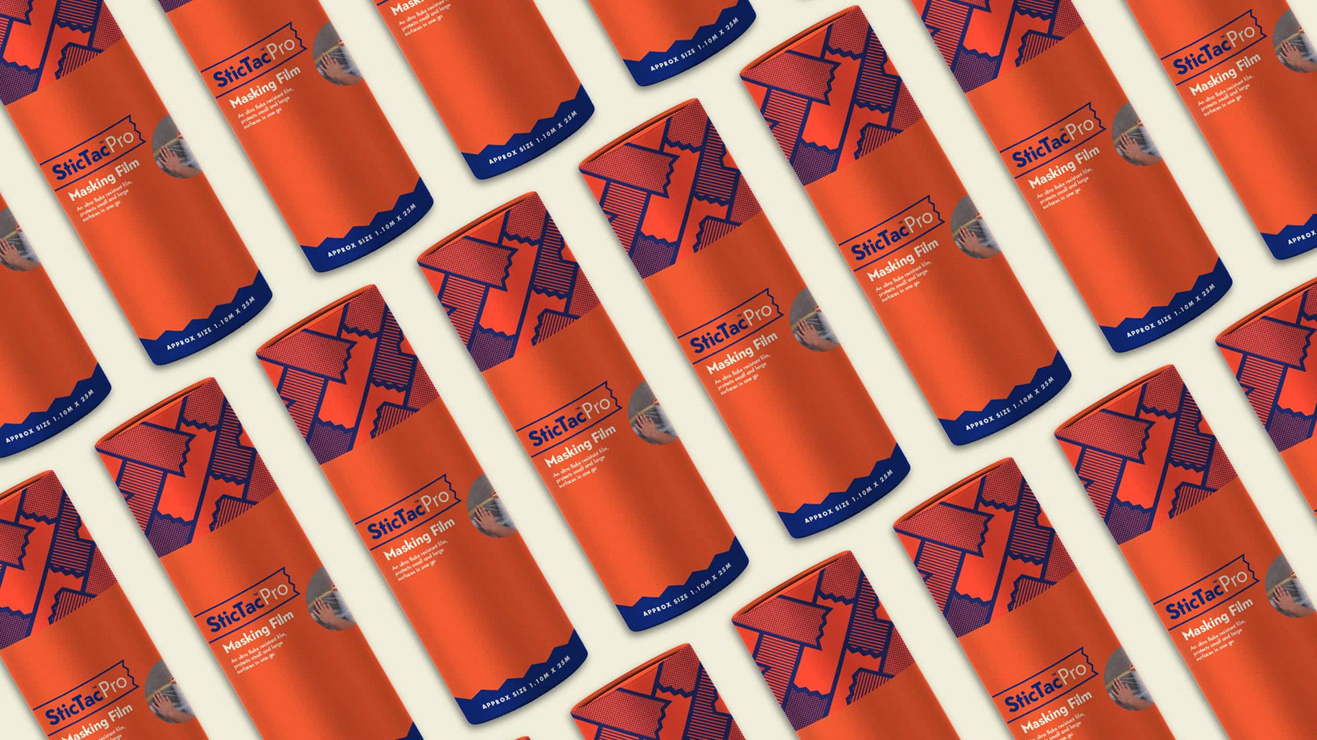
The whole strategy manifests itself in the product packaging. Creating one mold for all the products would go against the goal of making each product unique based on their use. Thus, the brand is held together by subtle use of its assets in the packaging.
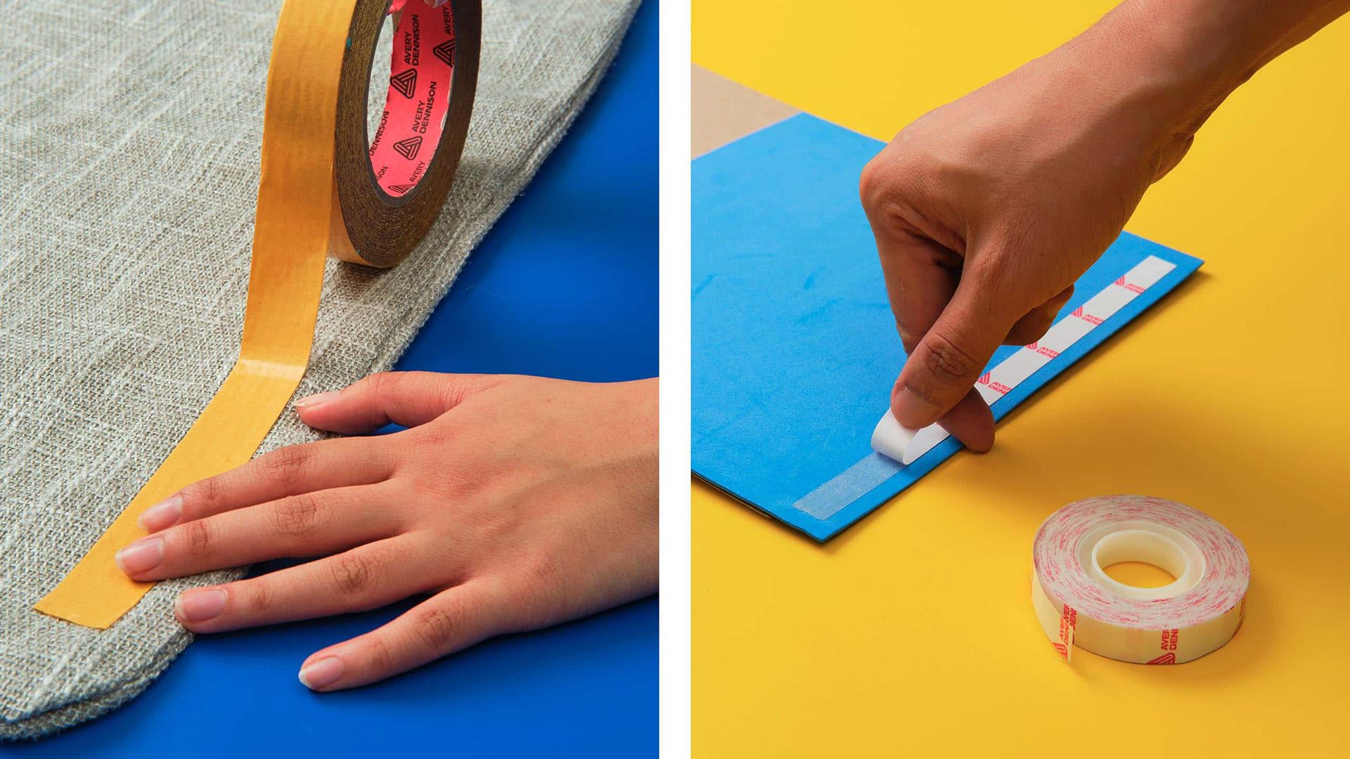
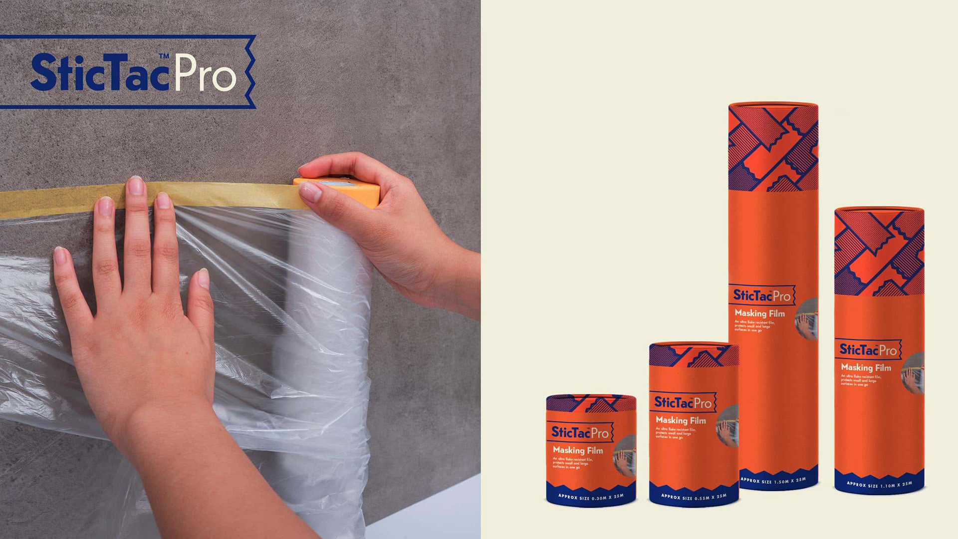
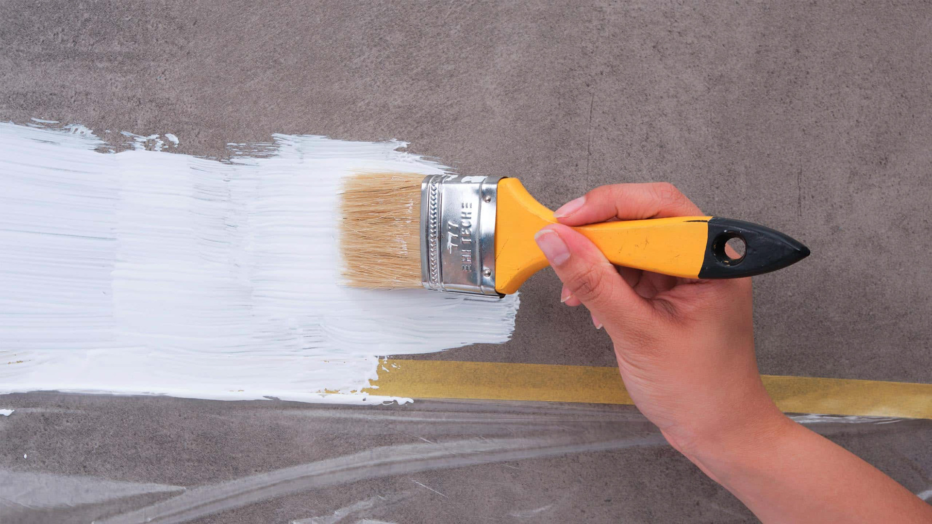
An important touchpoint of the packaging was photography. Through context clues showing a set-up, SticTac further contextualizes where the tape can be used. And through a how-to photo, every doer and maker is empowered with the idea that there is always a best way to do something—and that is through SticTac.
LET'S STICK TOGETHER
Stictac offers specialized tapes for work, arts and crafts, and for your home. Available at www.stictac.ph
Stictac offers specialized tapes for work, arts and crafts, and for your home. Available at www.stictac.ph
Follow them on Instagram and let's start sticking together.