OVERVIEW: BRAND AID
Serious Studio’s Brand Aid is a brand-building mentorship program that aims to help COVID-19 affected SMEs troubleshoot today, in order to future-proof tomorrow. The program aims to uncover core issues, figure out a feasible plan forward, and design a better future together — all for free to grantees.
WHAT WE DID
Brand Strategy
Brand Identity
Illustration
Packaging
Brand Identity
Illustration
Packaging
PROJECT TEAM
Creative Direction: Kookie Santos
Lead Strategy: Reena Mesias
Lead Design: Paolo Geronimo
Lead Strategy: Reena Mesias
Lead Design: Paolo Geronimo
BACKGROUND
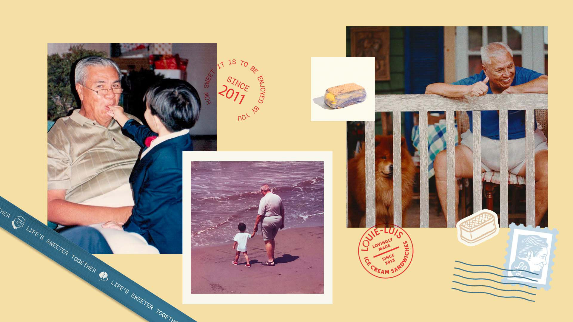
Louie-Luis, a humble and homemade ice cream sandwich brand in the south of the Metro, became part of the first batch of our Brand Aid initiative primarily because of their rich and touching story of the family who created it.
With everything going on, we believe it's important to hold on to and appreciate whatever form of happiness and comfort we can get—scrumptious sweets and special stories included.
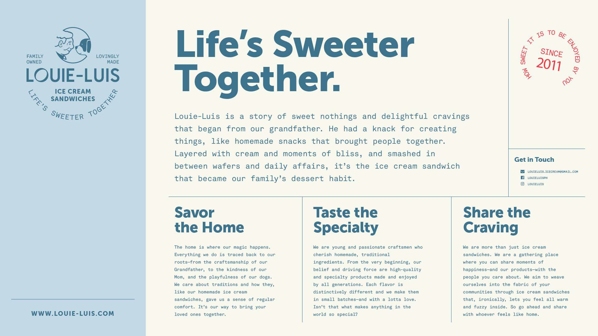
Our goal was to rebrand Louie-Luis in a way that would highlight their story, their craftsmanship, and the fact that the brand is really more than just ice cream sandwiches. We wanted to steer it in a direction where people can share and experience moments of warm and fuzzy happiness—all without alienating its already loyal customers.
IDENTITY: A FAMILIAL AND FAMILIAR TREAT
To achieve our goal, we took inspiration from the family's traditions and personal connections that were already embodied in their name, Louie-Luis. Louie-Luis was derived from:
Louie, the family's patriarch who's also considered the "father of Philippine cinema."
Luis, the grandson who went on to become a photographer.
Together, and with Louie's daughter/Luis' mom, they created a treat that then became a tradition—the ice cream sandwiches.
Thus for the visual narrative, we brought together this eclectic mix of elements—from nostalgia and pop culture to heritage and quality, to a sense of adulthood but also a child-like wonder.
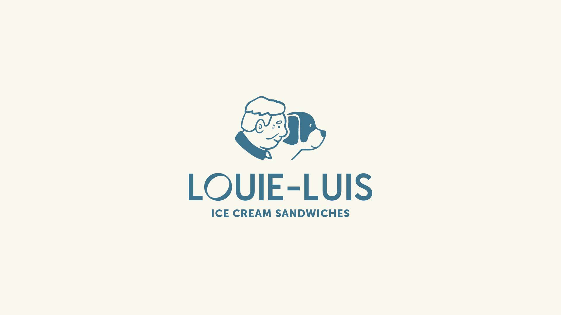
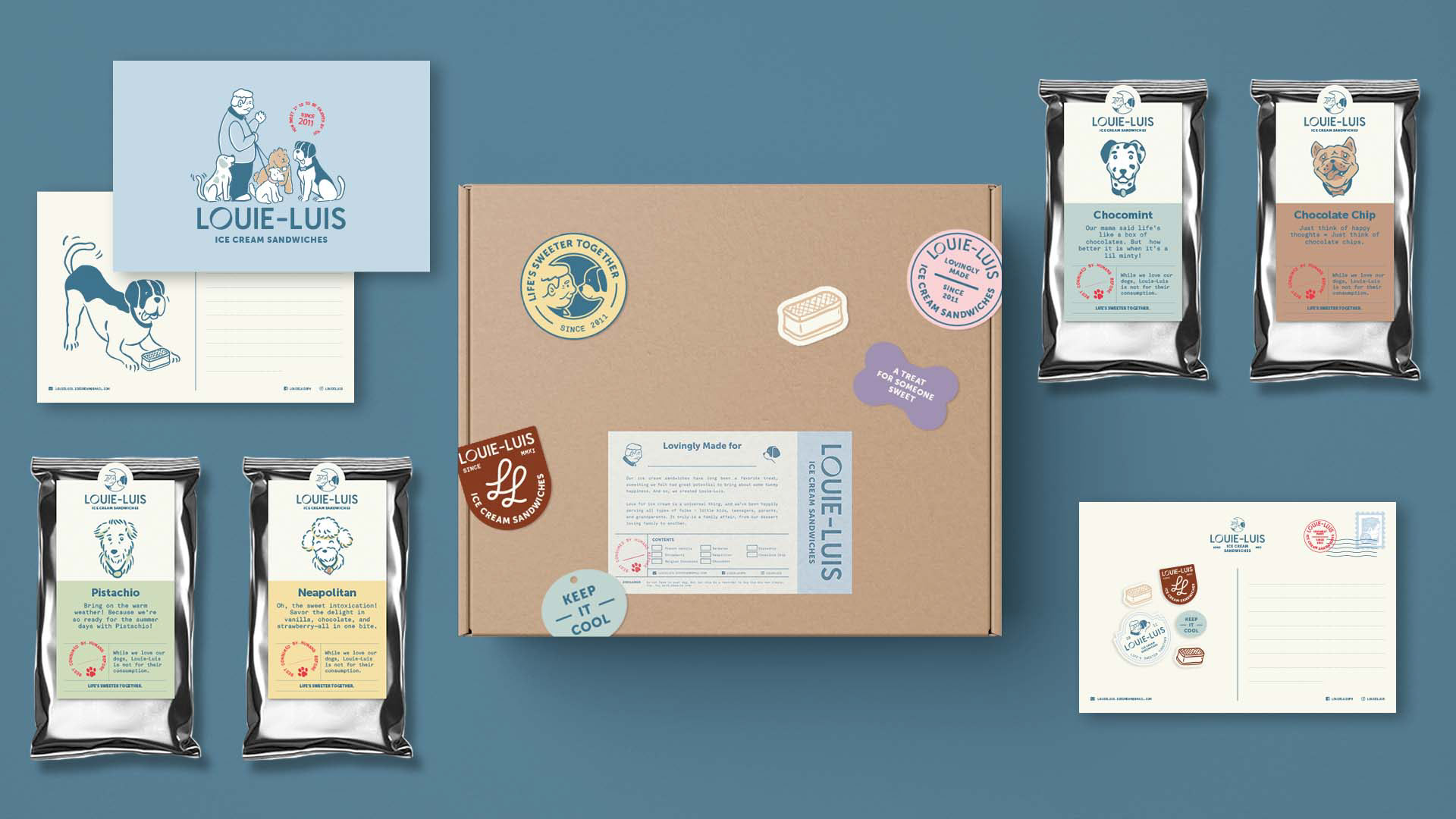
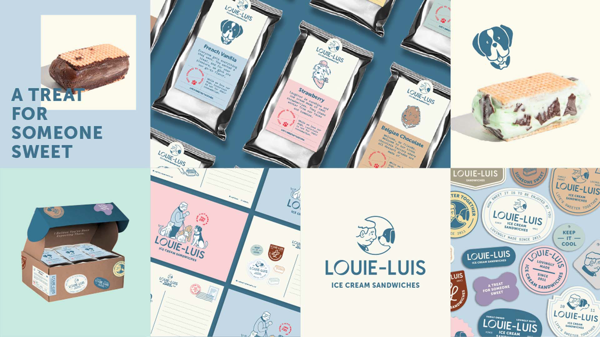
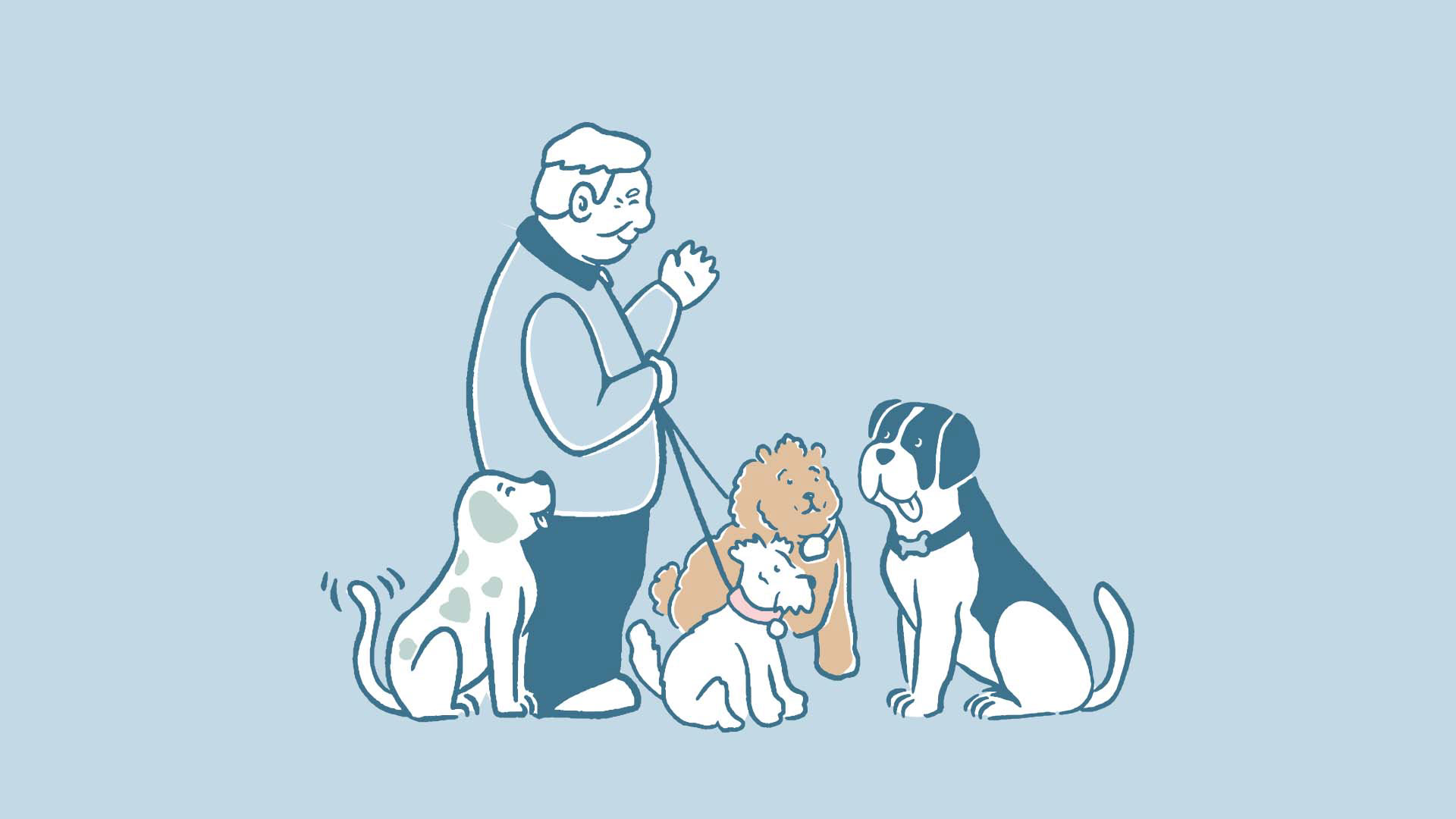
The logo incorporates illustrated representations of Louie and Luis to act as a tribute to the grandfather (Louie) and his grandson (Luis), who is symbolized by a dog—another very personal and essential member of the family. In fact, in real life, they have more than one! More on that later.
Using a comic-style illustration for a typically classic seal, we are able to highlight a fun and warm personality especially that it's balanced with a contemporary, modified san serif for its logotype.
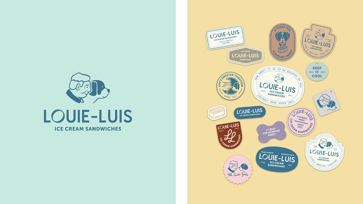
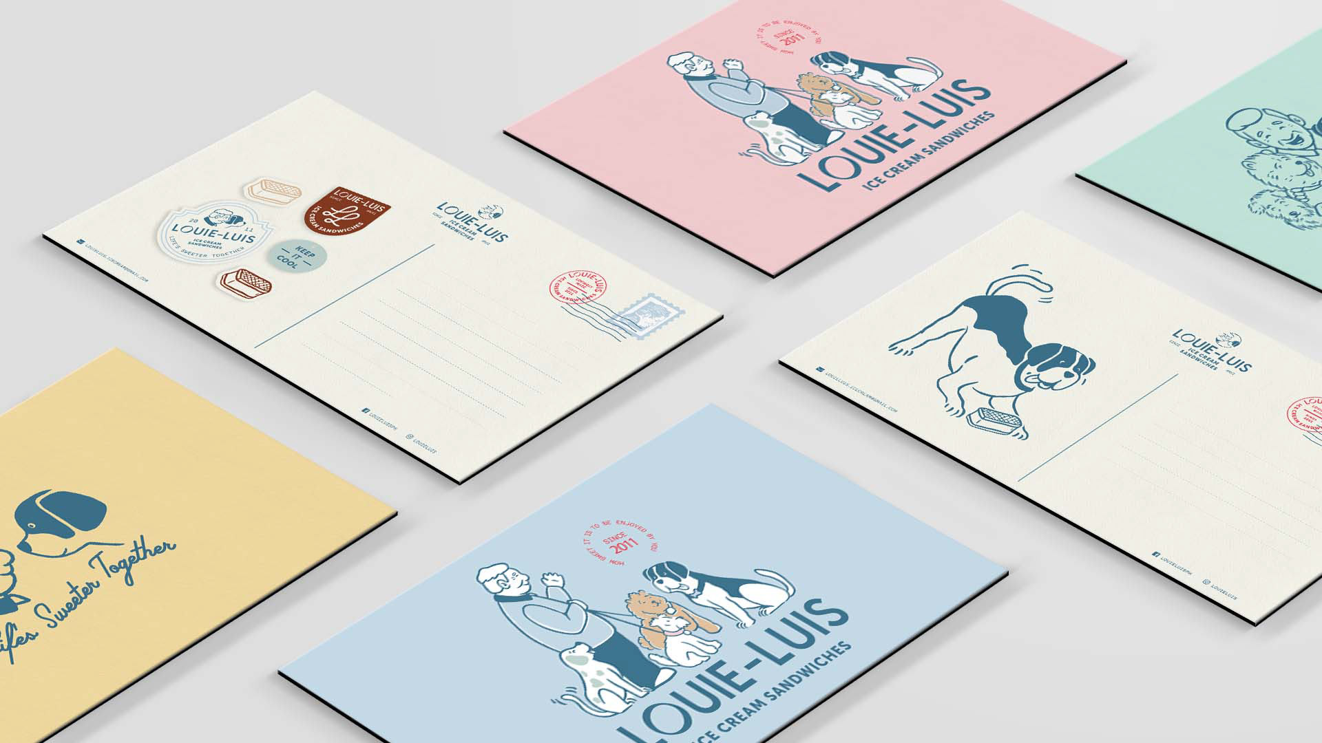
The logo is designed to be able to expand to different lockups and seals that are remarkably inspired by dog tags. These may be used to enhance the brand's materials, may it be decorative enhancements, stickers, or backdrops.
In keeping to the theme of mixing the old and new, the typesetting also plays between a monospace font reminiscent of the typewriter and a bold sans serif to represent modernity.
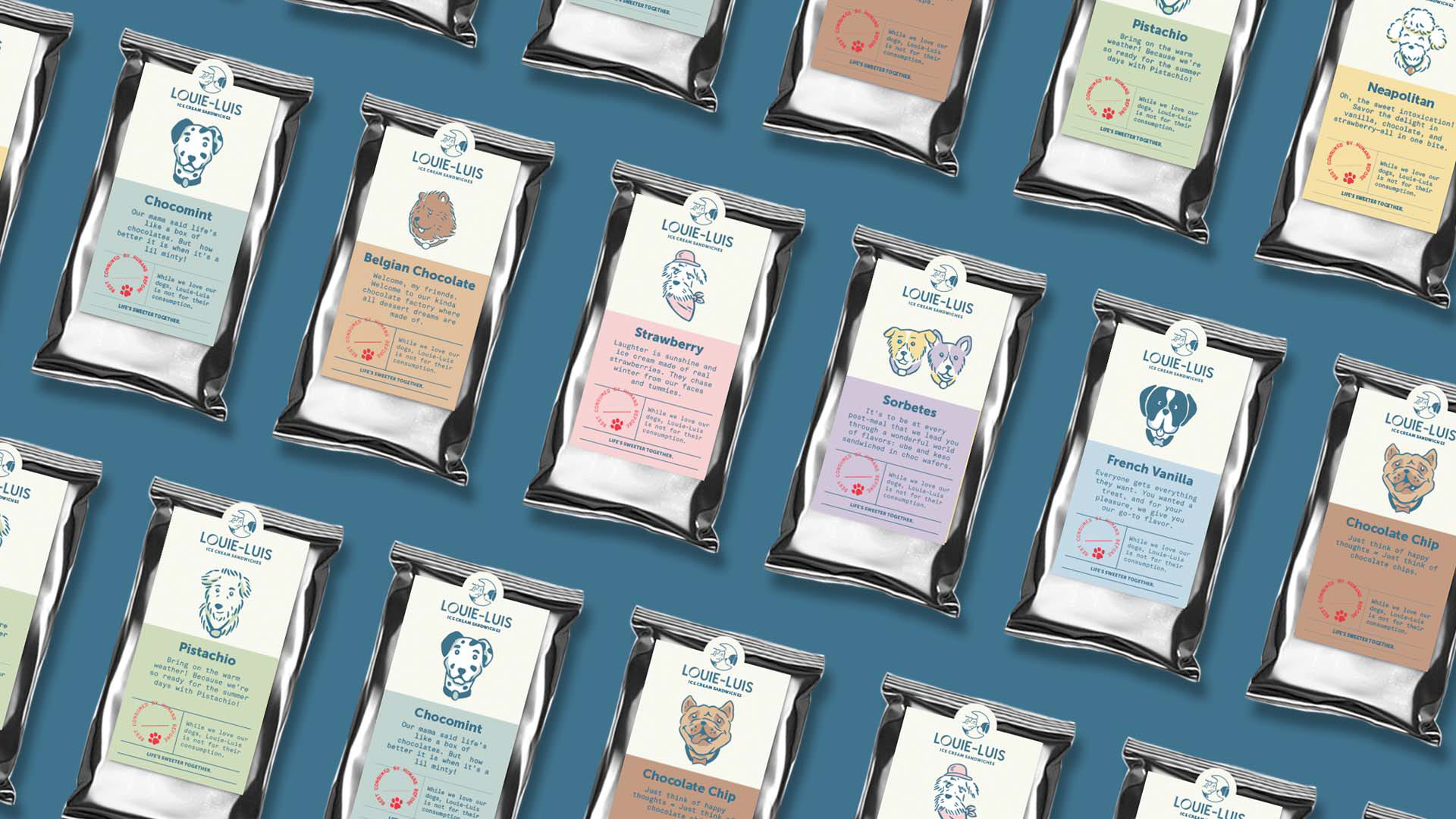
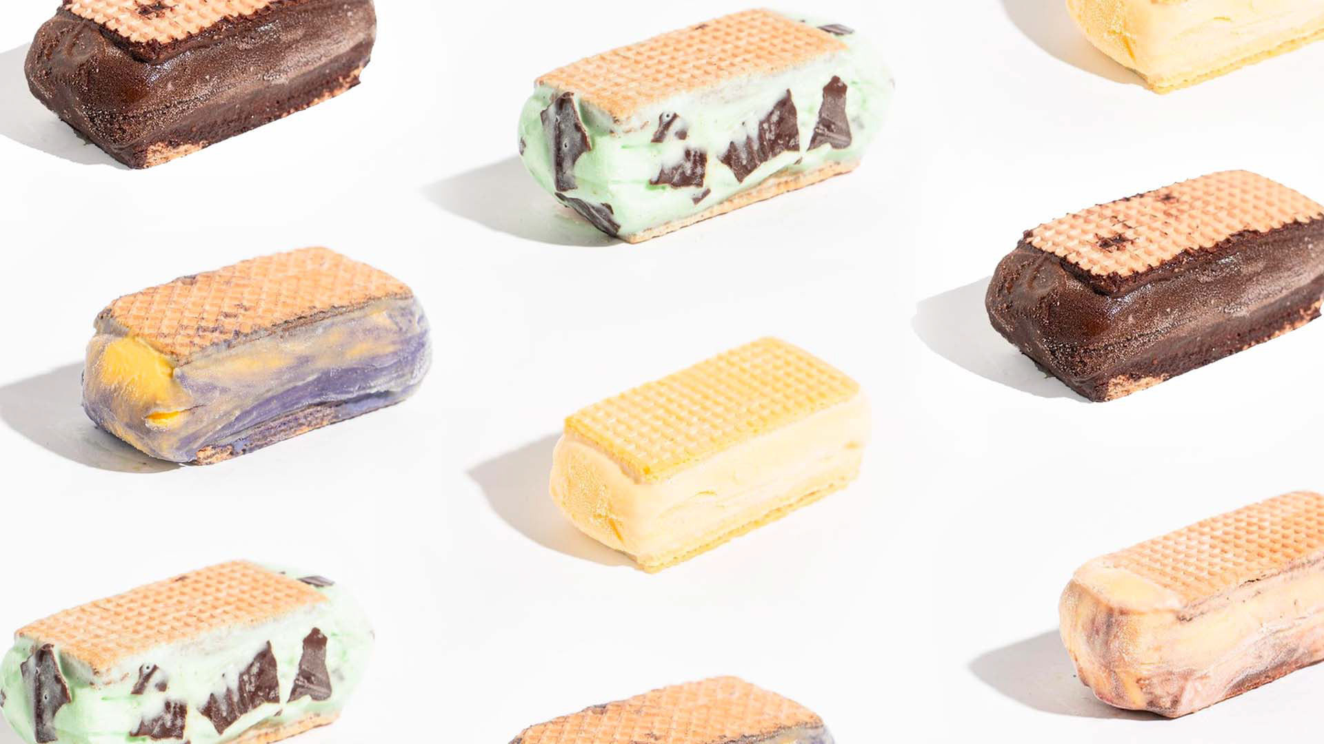
An emphasis on the product is shown through the choice of colors reminiscent of ice cream's creamy palette. This palette is significantly based on Louie-Luis' classic flavors like vanilla, chocolate, strawberry, and mint. They are combined with darker and earthier shades of the creams for contrast. Overall, the combination is playful, approachable, and modern, appealing to both children and adults.
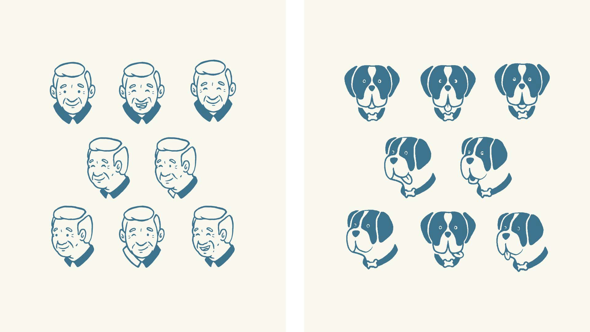
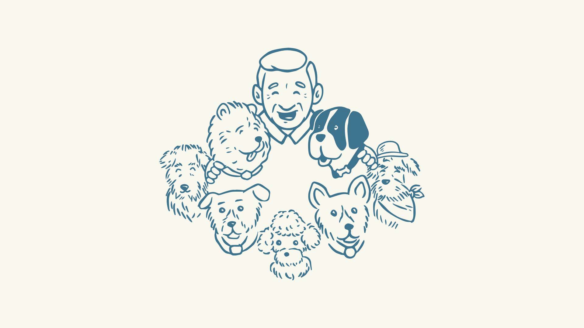
The illustrations are expanded from the logo with the comic-style characters personifying Louie, the grandfather, and Luis, the St. Bernard. Apart from the St. Bernard being the first dog of Louie's daughter/Luis' mom, St. Bernards are also known to be loving, gentle, and good with children! This gives the brand a more approachable vibe and underscores the personal relationship and story between real-life characters.
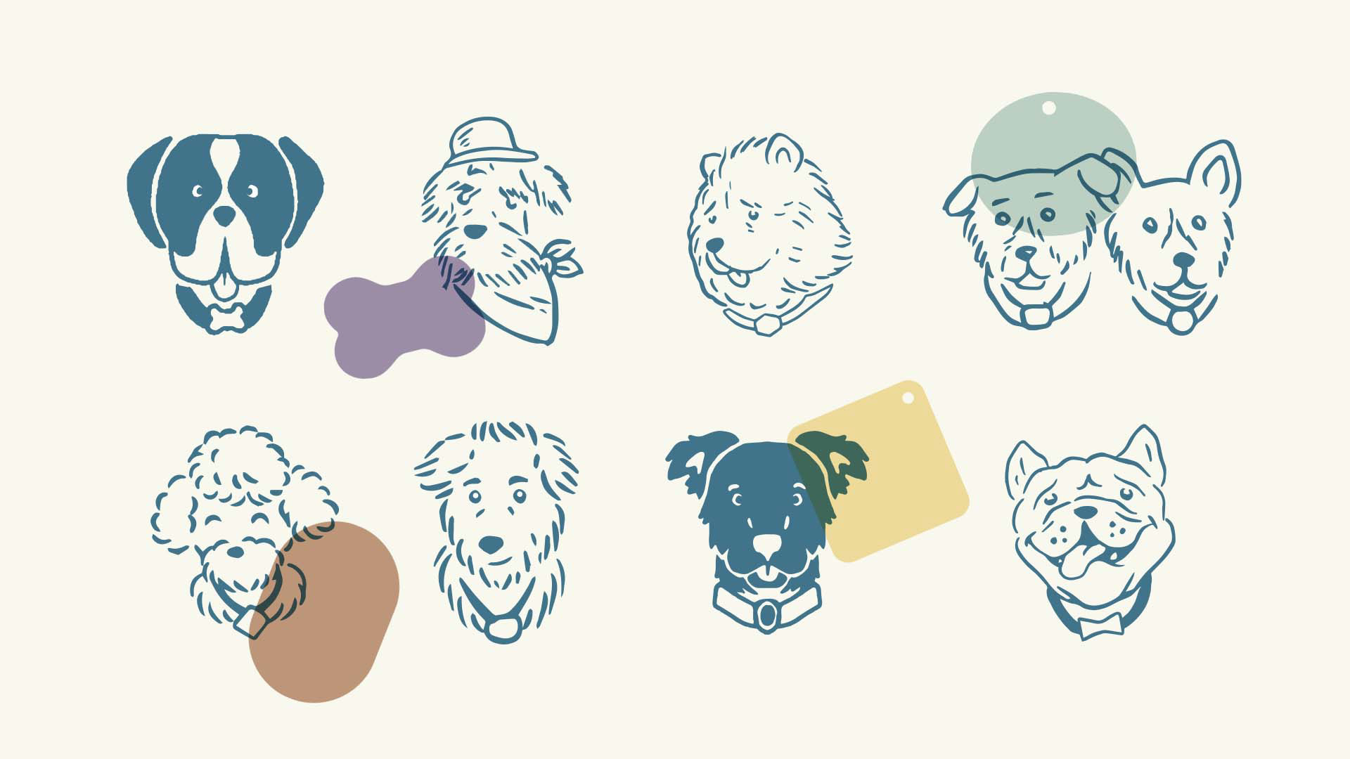
To complete the narrative, we introduced more of Louie's best friends, also highly inspired by the real dogs in the family throughout the years. Having these characters not only helps build the story of the brand but also help represents the various flavors of the ice cream sandwiches.

The packaging presented a series of challenges, one being the fact that the product needs to be stored in a cool place. A corrugated box was the best option for keeping ice cream sandwiches frozen during travel.
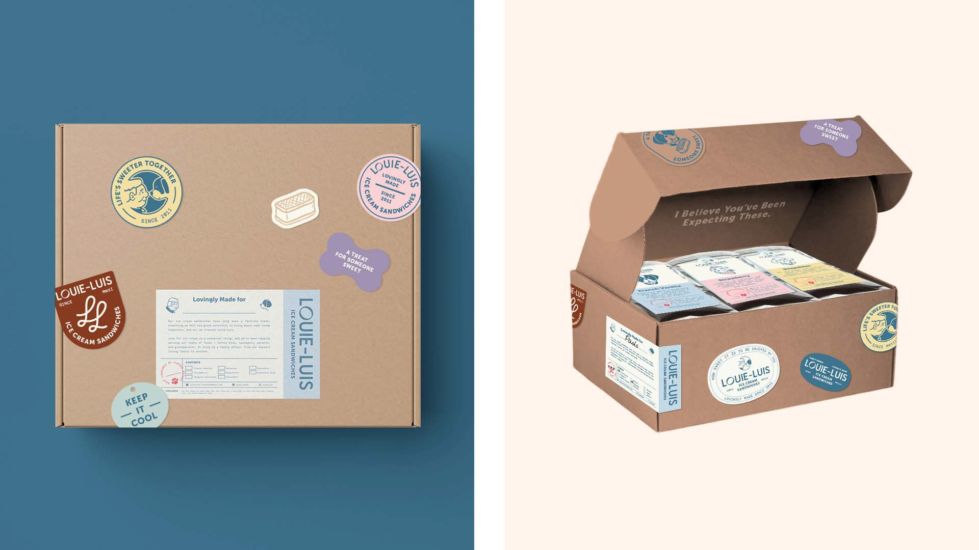
This limitation didn't stop us from wanting to create a fuzzy, tender experience that lies at the very heart of the brand. Elements like branded stickers inspired by vintage stamps and travel luggage, little clever copies here and there, and a custom label to allow personalization and provide product information are designed for a unique "un-boxing" experience. It also comes with a ribbon to evoke a message that Louie-Luis is a "gift" / treat for anybody sweet.
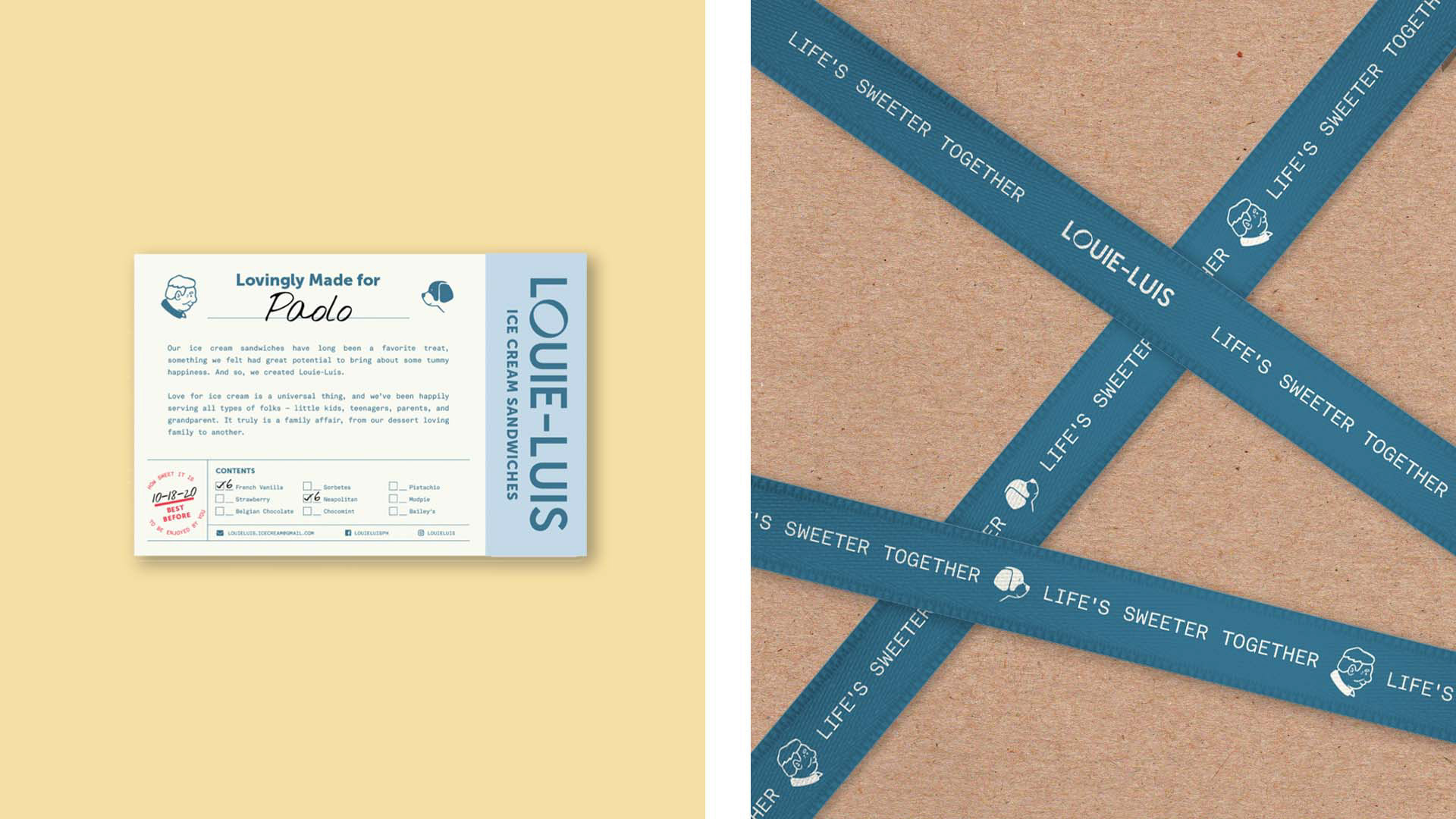
For easy identification and distinguishability, sticker labels on the ice cream sandwich packaging are color—and dog—coded to represent the flavors. It replicates some elements from the box packaging for consistency, and for additional charm, includes one-liner quotes. (modified to fit each flavor) from classic movies that are special to the family.
TASTE NEW TRADITIONS
Know more about Louie-Luis when you visit their instagram page and get your sweet fix here.